
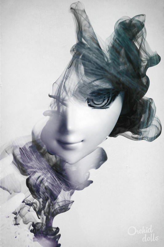
¡Buenos días! Hoy quiero compartir con vosotros un pequeño tutorial sobre cómo conseguir el efecto conocido como doble exposición en Photoshop, para que lo probéis con vuestras propias fotografías. Voy a usar de referencia el montaje que hice con una imagen de tinta en agua (o humo, queda practicamente igual) y una foto de Yuuko que quedó tal y como veis aquí abajo. ¿Preparados? ¡Pues al turrón!
Hi there! Today I want to share a little tutorial with all of you: how to create the double exposure effect in Photoshop, so you can try on your own pictures. I’m going to use one of my Yuuko pictures with an image of ink in water (or smoke, it looks practically the same) to illustrate this tutorial. ¿Ready? Then let’s go!
1. ¿Qué necesitas? // What do you need?
Para crear este efecto, lo único que necesitas es:
- Photoshop CS3 o versiones superiores
- Una foto de tu muñeca, a poder ser un retrato, ya que funcionan mejor en estas composiciones
- Un pack de pinceles con formas de “tinta en agua” o “humo”
In order to create this effect, all you need is:
- Photoshop CS3 or any later version
- A picture of your doll, a portrait if possible, as they work better in this kind of editions
- A pack of «ink in water»/ «smoke» brushes
2. Elegir los pinceles // Choosing the brushes
Los que estéis familiarizados con el Photoshop, seguramente ya tengáis una gran biblioteca de pinceles entre los que tal vez se encuentren los que he citado en el punto anterior, o si no, sabéis cómo buscarlos e instalarlos. Para todos vosotros, ¡podéis pasar directamente al paso 3!
Para los que no, o simplemente queréis repasar este tema, seguid leyendo.
For the ones who know Photoshop well, you may have a really brush library, including those I mentioned in the previous step. If you don’t, you may know how to look for, download and install them. If you feel like this, you can go directly to step 3!
If you don’t, please continue reading.
» La herramienta pincel del Photoshop es muy versátil, pero los pinceles por defecto del programa son limitados. Para este tutorial, buscaremos en google algo así como “ink water photoshop brushes” o “smoke photoshop brushes”, para bajarnos un paquete de pinceles cuyo formato sea .abr
Una vez tengamos el archivo, vamos al Photoshop y elegimos la herramienta pincel.
» The brush tool from Photoshop is really versatile, but default brushes are quite limited. So for this tutorial we need to look up in google something like “ink water photoshop brushes” or “smoke photoshop brushes”, and download them in .abr format.
Once we have the file, go to Photoshop and choose the brush tool.

Hacemos click en la pestaña de arriba, que es el control del pincel (también aparece haciendo click derecho sobre el lienzo).
Click on the brush tab above, that’s where we’ll control the brushes (it also appears right-clicking over the canvas).
 Hacemos click en el icono del engranaje, arriba derecha, y elegimos la opción cargar pinceles.
Click on the gear icon, top right, and choose the option Load Brushes.

Cargamos el archivo que nos hemos bajado, y ahora los pinceles de ese paquete aparecerán en la selección de pinceles:
Once we load the files, we can see all the brushes on the selection area:

No recuerdo cuál es el paquete que uso en este montaje exactamente porque he estado bajándome pinceles durante muchos años, pero seguro que podéis encontrar algo parecido fácilmente. Los que uso yo tienen esta pinta:
I can’t remember exactly which group of brushes I’m using ‘cause I’ve been loading brushes to my Photoshop for ages, but I’m sure you can fin something similar easily. My ink brushes look like this:

Una vez tengáis los pinceles descargados e instalados, pasemos a la parte creativa.
Once you have your brushes loaded in Photoshop, let’s move on to the creative part.
3. Diseñando la composición // Composition design
En este paso decidiremos qué entra y qué no en nuestra composición. Para empezar, abrimos nuestra fotografía en Photoshop.
In this step we’ll decide what’s on our composition and what’s not in it. To begin, open your picture file in Photoshop.

Yo he decidido usar una de mis imágenes en blanco y negro por cuestiones estéticas, pero no hay problema si está a todo color. Igualmente, si la queréis pasar a B/N, es tan fácil como ir a Imagen > Ajustes > Blanco y negro.
I’ve decided to use one of my black and white pictures of Yuuko for aesthetic reasons, but there’s no problem in using a full color picture. Anyway, if you’d like to convert your picture to B/W, you just need to go to Image > Adjustments > Black & White.

Ahora vamos a elegir el pincel que va a ser el “continente” de nuestra foto, es decir, nuestra foto sólo se va a ver dentro de la mancha del pincel. Aquí se trata de ir jugando y elegir la forma que nos guste más de la tinta/humo, así que probaremos unos y otros encima de nuestra imagen.
Creamos una nueva capa haciendo click en el botón de abajo o desde Capa > Nueva > Capa.
Now we’re going to choose the ‘continent’ of our picture, that is to say, our picture will only be seen through the stain of the brush. Here you have to play a little bit with the brushes and find the shape you like the most, so we’re going to try most of them over our picture.
Create a new layer clicking down there on the layer panel, or going to Layer > New > Layer.

A esa capa le asignaremos una opacidad entre el 30 y 50%, a vuestro gusto. Esto es para que la mancha que nos deje el pincel no tape del todo nuestra imagen y nos ayude a imaginarnos la composición final.
Set a 30%~50% opacity to the new layer, as you like. This is helpful because you can see both the ‘ink’ and the picture we’ll see through it.

Elegimos la herramienta pincel y, si nuestra imagen está en blanco y negro, recomiendo elegirle un color. A partir de aquí, probamos todos los pinceles que nos hemos bajado hasta encontrar la forma que nos guste.
Recordad que si encontráis la forma que os gusta, podéis cambiar el tamaño y la posición tanto del pincel como de la fotografía, pinchando en la capa que queremos modificar y pulsando control+T. Si colocamos el cursor sobre los bordes, podrás girar o escalar estos objetos.
Choose the brush tool and, if our background picture is in B/W, I recommend to pick a color for our brush. Now try all your new brushes until you find the one you like the most.
Remember that if you don’t find the perfect shape at first, you can change the size and position of both brush and picture by pressing contr+T (transform). If you move the pointer to the corners, you can rotate or scale those objects.

En mi caso, elegí el pincel que veis en la siguiente foto porque tiene bastantes zonas opacas (ahí es donde la imagen se verá con más fuerza), y diréis: ¿cómo podemos saber si es tan opaca si teníamos nuestra capa al 30~50% de opacidad? Fácil, voy variando la opacidad para comprobarlo con todos los pinceles que pruebo.
In my case, I chose the following brush you see in the image below because it has a lot of opaque areas (there’s where the background picture will be better seen), and you wonder… how do we know that it’s really opaque if previously we put an opacity of 30~50% to that layer? Easy, I keep changing the layer opacity all the time to check it with all the brushes I try.

Esta es mi decisión final, básicamente porque el hecho de que se le vea solo un ojo le añadirá interés y misterio. Además, el humo está creando una diagonal, que hablando de composición, siempre crea impresión de dinamismo. La verdad es que cuesta hacerse una idea -de momento-, pero al aplicar el siguiente punto 4 lo veremos muy claramente y podremos seguir modificando la tinta/humo.
This is my final decision, basically ‘cause the fact that we can only see one eye will make it more interesting and mysterious. Furthermore, the smoke creates a diagonal that brings dynamism to the composition. I know it’s a bit difficult to preview how it’s going to look, but in the next step we’re going to see it clearly and also we can modify the ink/smoke.

4. Crear la máscara de recorte // Using the clipping mask
Una máscara de recorte es el nombre que le da Photoshop a lo que conocemos nosotros como “plantillas”. ¿Os acordáis de los graffittis hechos con plantilla? Por una parte tenemos una hoja con el recorte, y por otra parte tenemos la pared/soporte que es donde quedará la pintura. Pues bien, en la vida real colocaríamos la plantilla encima de la pared y a través del agujero del papel veríamos los ladrillos y, siguiendo esta lógica, en Photoshop colocaríamos arriba la capa que contiene el dibujo y abajo nuestra foto (que vendrían a ser la plantilla y la pared respectivamente). Pero la vida no es tan fácil y al Photoshop no le gusta esa disposición, too mainstream, así que para que nuestra Máscara de recorte funcione debemos colocar arriba nuestra foto y abajo nuestra capa con la tinta/humo, como indico en este pequeño gráfico.
A clipping mask is in Photoshop what we know as stencils. Do you remember that stencil graffiti on the wall? On one hand we have the sheet of paper with the cutout, and on the other hand we have the wall in which is going to be the paint. Well, in real life we should put the stencil over the wall, so we can see the bricks through the cutout. So, following this logic, we could think that in Photoshop we have to put the brush layer over the background picture, but life is not that easy and the correct way to place the layers if we want to do a clipping mask is: background picture over the ink brush layer, as I show in this little graphic:

Ahora viene la magia: hacemos click derecho en la capa de nuestra foto, en mi caso la capa ‘Yuuko’, y elegimos la opción Crear máscara de recorte. Esto hará que solo veamos nuestra foto a través de las zonas opacas de la capa inferior.
Here comes the magic: right click on the picture layer, in my case the ‘Yuuko’ layer, and choose the option Create Clipping Mask. This will make our picture visible only in the opaque areas of our lower layer.

Le añadiremos una capa de fondo blanca para que se vea el efecto y sea más fácil de retocar. Para ello crearemos una nueva capa y con la herramienta Bote de pintura la rellenaremos de blanco y la arrastraremos abajo de las dos anteriores capas.
We’re going to add a white background to clearly see the effect and making it easy to modify. So create a new layer, choose the Paint Bucket tool, fill it with white and then drag it below our two layers.

Et voilà. Nos tendría que quedar algo así de momento:
Et voilà. We should see something similar to this at the moment:

5. Modificar la máscara de recorte // Customizing the clipping mask
La capa de la tinta/humo aún se puede modificar para obtener mejores resultados. Recordad que la función de esa capa es tan simple como dejar ver la fotografía de arriba a través de las zonas más opacas. En mi caso necesito hacer más visible la zona de la cara, en especial el ojo y la boca. Para ello me colocaré en la capa 1, la de la tinta/humo, y cogeré un pincel con bordes suavizados como estos:
The ink/smoke layer can be modified to obtain better results. Remember how that layer works: we can see the picture on the layer above through the opaque areas. I want to make her face more visible, specially the eye and mouth, so I’ll go to layer 1 (the one with the ink/smoke brush) and use a brush with soft edges like these ones:

Si tenemos el pincel al 100% de opacidad (y sea del color que sea, eso no influye, sólo la opacidad), podemos empezar a hacer pruebas para ver cómo funciona. Aquí una muestra de lo que pasa si modificamos esa capa…
If our brush opacity is 100% (we don’t care about the color, it has no influence on the clipping mask, only opacity), we can start doing tests to see how it works. Here you have a little example of what happens if we modify that layer…

Aquí podéis perfeccionar vuestra máscara de recorte como más os guste, incluso añadiendo más pinceles de tinta/humo. En mi caso lo he dejado así, aclarándole la zona de la cara, ya que el ojo es el centro de atención más importante en mi composición:
Now you can leave your clipping mask as you like, even adding more ink/smoke brushes. In my case I used the brush on the face, specially the eye, as it’s the spotlight of my composition:

6. Ediciones finales (opcional) // Final edits (optional)
Este último paso es opcional ya que el efecto de la doble exposición ya está terminado, así que si os gusta vuestro resultado podéis plantaros aquí. Si queréis añadirle un poco más de color y textura, seguid leyendo.
Mi idea es darle un color diferente a cada esquina de la diagonal. Para ello voy a crear una nueva capa por encima de la de ‘Yuuko’ y voy a elegir la herramienta Degradado.
This last step is optional as the double exposure effect is already finished. But if you want to add a bit more of color and texture, keep on reading.
My idea is giving the picture a different color in each diagonal corner. So let’s create a new layer over the ‘Yuuko’ layer and chose the Gradient tool.

Vamos a hacer click en la barra que aparece arriba a la izquierda para que se nos abra el menú del Editor de Degradado.
Click on the gradient bar above so we can edit it.

Aquí vamos a crear un nuevo Degradado que vaya de un color opaco a transparente por completo. Podemos emplear de base uno que ya tenga esta característica y simplemente cambiarle el color, como por ejemplo el que va de negro a transparente (sabemos que es así porque en Photoshop se simboliza con unos cuadrados grises y blancos) y cambiarle el color haciendo doble click en el icono de la flecha de la izquierda del degradado. Yo he elegido un verde menta, aunque no os preocupéis que luego lo modificaremos a nuestro gusto.
We’re going to create a new Gradient that goes from a opaque color to transparent. We can use a basic gradient from the ‘default settings’, this way we only need to change its color, for instance I’ll use the one that goes from black to transparent (we know that because in Photoshop it appears as grey and white squares). We can change the color by clicking the little arrow icon on the left of the gradient. I’ve chosen a mint green, but don’t worry, we can change it later.

Una vez tengamos nuestro propio degradado configurado, lo aplicaremos desde la esquina superior derecha hasta la esquina inferior izquierda. Nos tendría que quedar algo así:
Once we have our edited gradient, apply it from the upper right corner to the lower left corner. It should look like this:

En la ventana de capas, le aplicamos el modo de fusión “Subexponer Color”:
In the layer window, apply the «Color Burn» blending mode:

Y para que nos tiña solamente el area de la tinta/humo, hacemos que también sea parte de la máscara de recorte, así que hacemos click derecho sobre la capa y “Crear máscara de recorte”.
In order to dye only our ink/smoke area, we make that this new gradient layer be part of the clipping mask, so right click on the layer and chose «Create clipping mask».

El color es demasiado fuerte para mi gusto así que modificaré la capa. Lo primero que hago es agrandar esta capa con Contr+T y moverla hasta que se suavice un poco el color y que solo le afecte a la parte derecha de la cara.
The color here is quite strong, in my opinion, so I’ll modify it. The first thing I do is enlarge the layer with contr+T and move it until the color lightens and it only affects to the right part of the face.

El verde sigue siendo demasiado intenso así que voy a ir a Imagen > Ajustes > Tono/Saturación para modificarlo.
My green is still quite intense so I’ll go to Image > Adjustments > Hue/Saturation to edit it.

Id jugando con estos tres valores hasta conseguir el resultado que más os interese.
Test this tools until you find the perfect result.

En la foto de abajo veis mi resultado. Recordad que podemos bajarle la opacidad a la capa si queremos restarle presencia a la capa en cuestión.
In the picture below you can see my result. Remember that we can always lower the layer opacity if we want to reduce its presence.

Repetiremos estos mismos pasos con un segundo color que venga desde la esquina inferior izquierda. Yo he elegido el morado que proviene de la tríada verde-lila-naranja, sin usar este último. Vosotros podéis elegir cualquier color, no hace falta que salga de ningún grupo o paleta de colores, y podéis añadir tantas capas como queráis, ¡imaginación al poder!
Repeat the same steps with a second color in the lower left corner. I’ve chosen purple because of the green-purple-orange triad, without using the last color. You can choose any color, it doesn’t matter if it’s from a default color palette or not, and you can add as many layers as you like, use your imagination!

Para terminar, le he añadido una textura de papel rugoso y con imperfecciones. Para ello podemos bajarnos una imagen de la textura del papel que deseemos (sea papel arrugado, de acuarela, etc) o también podemos escanear alguno que tengamos por casa. Arrastramos el archivo a Photoshop sobre una capa nueva y lo transformamos y escalamos a nuestro gusto.
Finally, I’ve added some paper texture with some grain and imperfections. We can download the paper texture we want, or simply scan any paper you have at home. Drag the file to Photoshop in a new layer, then transform and scale it to your liking.

Como no queremos que nos modifique nuestra foto no le aplicaremos un modo de fusión sino que simplemente arrastraremos la capa hacia abajo para usar el papel de fondo en vez del blanco liso y artificial. La colocaremos aquí:
We won’t use a blending mode as we don’t want the paper to modify our picture, so we just drag the paper layer to the bottom, to use it as a simple background, instead of a pure white.

¡Terminado!
Finished!

Ahora solo falta que le coloquemos la firma, si tenemos, y ya la podemos compartir con el mundo ^_^
Now we just need to place our watermark (if we have one) and that’s it! It’s ready to be shared with the world ^_^
¡Y hasta aquí el tutorial! He querido compartir este proceso porque algunos me lo pedisteis y porque me parece que es muy sencillo y divertido en realidad: ¡una vez lo has probado ya quieres empezar otro nuevo con otros pinceles y otros colores! 😀
Espero que os haya sido útil, os dejo con otros dos ejemplos de montajes que podemos hacer con este mismo proceso. ¡Nos vemos en el siguiente post! ~
And that’s all! I’ve wanted to share this tutorial ‘cause some of you asked for it and I really think it’s easy and funny to do: once you’ve tried you can’t stop doing new creations with new brushes and colors! 😀
I hope you find it useful, here you have two other examples of pictures made with this process. See you in the next post! ~


Muy buen tutorial Tali,si tengo un hueco hoy o mañana a ver si pruebo a ponerlo en práctica :3
Gracias Yllia! 😀 ¡espero que te diviertas pues! ^_^
Siii,ya te contaré jejeje ❤
Qué completo!
La parte que más me ha interesado ha sido la de añadir las capas de colores en gradiente. Ya decía yo que no se veía igual q la q subiste :3
A ver si cuando llegue mariko *cruza los dedos fuerte y toca madera* le hago fotitos y pruebo a hacerlo (aunque no sé cómo haré con el cutre móvil xD)
Gracias!! *_* ah bueno, pero el resultado final es exactamente como la foto que enseñé hace un tiempo, de hecho es esa que he puesto desde flickr! x3 he repetido los pasos que hice en esa misma foto º,º
Si!!! a ver si hay suerte con tu Mariko, sería genial que te tocara después de lo que estás sufriendo jaja
Pingback: Tutorial: ink effect – ROLL OUT THE BARIL·